
Teaching graphs and data analysis does not have to be dull or confusing for students. When lessons include hands-on activities and relatable topics, students become more excited to learn how to collect, organize, and interpret data. Using simple, interactive methods makes graphing meaningful and helps students build confidence in their data skills.
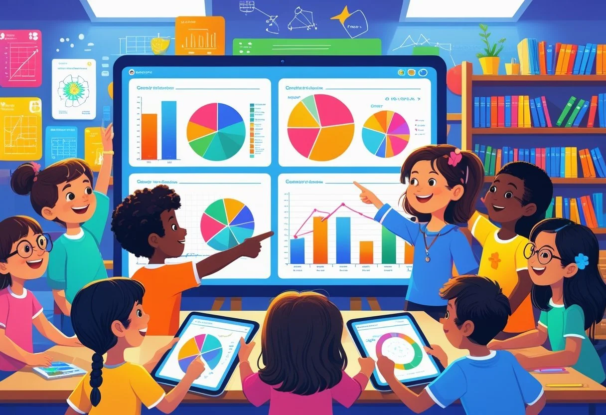
Students benefit most when they learn through activities like creating bar graphs, picture graphs, and line plots based on real data they collect themselves. These experiences make abstract ideas easier to understand and show how data connects to everyday life. Engaging students with creative and practical exercises builds strong foundations for critical thinking and data interpretation.
Incorporating different types of graphs and simple data sets ensures students grasp key concepts clearly. Using well-chosen activities helps them recognize patterns, draw conclusions, and apply their skills across subjects. This approach supports better understanding and lasting knowledge in graphing and data analysis.
Key Takeaways
Hands-on activities help students learn to organize and interpret data effectively.
Real-world data and simple graphs make lessons relatable and easy to understand.
Building skills in graphing supports critical thinking and connections across subjects.
Making Graphs and Data Analysis Engaging
Engaging students in graphing and data analysis requires strategies that involve active participation and connect learning to real interests. Hands-on activities and using topics students care about can increase their focus and help them understand how to collect, organize, and interpret data effectively.
Incorporating Hands-On Activities
Hands-on activities help students learn graphing and data analysis by making abstract concepts clear. For example, students can collect data by measuring objects, timing events, or observing classroom behavior.
Activities like creating bar graphs with physical objects, plotting points on grid paper, or using tally charts make data visible and easier to understand. Manipulating materials helps students see patterns and relationships in data.
Interactive tools such as graphing games, worksheets, or digital apps also support active learning. These tools encourage students to create and interpret different types of graphs like line plots, pie charts, and bar graphs.
Utilizing Student Interests for Data Collection
Connecting data collection to students’ interests increases motivation and makes graphing more relevant. Teachers can design projects where students gather data about topics they enjoy, such as favorite animals, sports, or music preferences.
If students research animals, they might collect data on habitat types, diet, or behaviors and then graph this information. This links science and social studies with math skills.
Letting students choose what they want to explore supports engagement and ownership. This approach also allows for cross-curricular connections, enriching the learning experience while reinforcing graphing and data analysis skills.
Essential Types of Graphs in the Classroom
Visual tools help students understand and organize information clearly. Different types of graphs serve specific purposes, like comparing categories, showing trends over time, or displaying data sets in simple formats.
Bar Graphs for Comparing Categories
Bar graphs show data using rectangular bars. Each bar’s height or length corresponds to the value it represents. This makes it easy to compare different groups side by side.
Teachers often use bar graphs to help students compare things like the number of books read by each class or the count of pets owned by students. Bars can be vertical or horizontal, and labels on the axes provide clear details about the categories and numbers.
Bar graphs make differences easy to spot. They also support discussions about which categories have the highest or lowest values. This visual clarity helps develop analytical thinking.
Line Plots for Tracking Data Trends
Line plots display data points above a number line. They are useful for showing how values change over time or across categories.
Students can use line plots to track scores on tests or count how many days it rains in a month. Each point represents a value, and trends become clear when points form upward or downward patterns.
Line plots help learners see increases, decreases, or steady values. This understanding of trends is important when analyzing real data and making predictions.
Stem-and-Leaf Plots to Display Data Distribution
Stem-and-leaf plots organize numbers to show how data is spread out. The "stem" is the first part of the number, and the "leaf" is usually the last digit.
For example, if the data points include 23, 25, and 27, the stem would be 2, and the leaves would be 3, 5, and 7 grouped next to it. This format keeps individual values visible while showing clusters and gaps.
These plots help students understand data distribution and spot the most common values. It’s also a great stepping stone toward studying more complex statistics.
Tally Charts for Simple Data Collection
Tally charts use marks grouped in fours with a diagonal fifth mark to easily count items. They are quick and practical for collecting raw data.
In classrooms, tally charts can record how many students prefer certain fruits, favorite colors, or types of pets. The visual grouping simplifies counting and reduces errors.
Tally marks also introduce students to organizing data before making charts or graphs. They build foundational skills in data collection and categorizing information.
Creative Data Analysis Strategies
Engaging students in data analysis requires approaches that motivate participation and promote understanding. Strategies that combine interaction with real-world relevance can help students grasp the concepts behind teaching graphs and interpreting data clearly.
Game-Based Learning Approaches
Games make data analysis more hands-on and enjoyable. For example, students can play graph-building challenges where they collect small sets of data and race to represent it accurately on different types of graphs like bar graphs or pie charts. This encourages quick thinking about which graph best suits the data type.
Teachers might also use quiz games that focus on interpreting graphs. Students analyze graphs in timed rounds to answer questions about trends, patterns, or specific values. This method improves both speed and accuracy in reading data visuals.
These games build skills in identifying key information and strengthen critical thinking. Students remain engaged while practicing graph interpretation in a fun, low-pressure way.
Project-Based Data Activities
Project-based activities connect data analysis to real-world topics. Students might survey classmates on favorite books or snacks, then organize their findings into tables and graphs. This hands-on data collection helps students understand tallying, categorizing, and graphing steps clearly.
Projects can span multiple lessons, allowing students to create complex graphs and practice explaining results in simple terms. This reinforces their ability to communicate data findings effectively.
Teachers often suggest using themes relevant to students’ lives to increase interest. For instance, tracking weather changes or sports statistics links data work with daily experiences, making the lessons practical and memorable.
Understanding Key Data Concepts
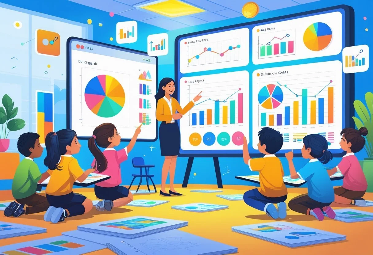
Data analysis starts with grasping basic ideas about numbers in a set and knowing how to read visual information. It involves figuring out important values that summarize data and learning how to draw meaning from charts and graphs.
Calculating Mean, Mode, and Range
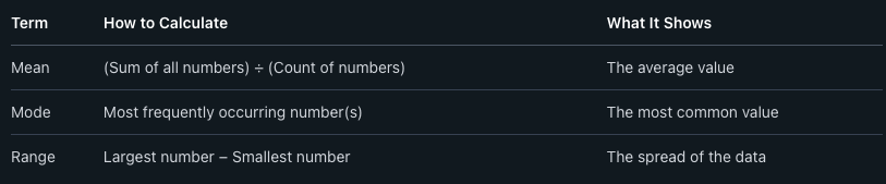
The mean is the average of a set of numbers. To find the mean, you add all the numbers together and then divide by how many numbers there are. It gives a central value that represents the data.
The mode is the number that appears most often in a set. A set can have one mode, more than one, or none if all numbers appear with the same frequency. Knowing the mode helps identify common or popular values.
The range tells how spread out the numbers are. It is found by subtracting the smallest number from the largest. The range shows the difference between the highest and lowest values in the data.
Interpreting Graphical Data
Understanding graphs means reading the information they show quickly and clearly. Different kinds of graphs include bar graphs, line graphs, and pictographs. Each type helps show data in a specific way.
Bar graphs compare amounts between different groups. The height of each bar shows the value. This makes spotting the biggest or smallest categories easy.
Line graphs show changes over time. Points connected by lines reveal trends, like increases or decreases.
Pictographs use pictures to represent numbers. They make data more visual and simple to understand but may not show exact values.
To interpret graphs well, it is important to:
Look at titles and labels to know what the data is about.
Check the scale to understand the number values.
Compare different parts to find patterns or differences.
This skill helps students read and use data from many subjects, not just math.
Cross-Curricular Connections and Real-World Applications
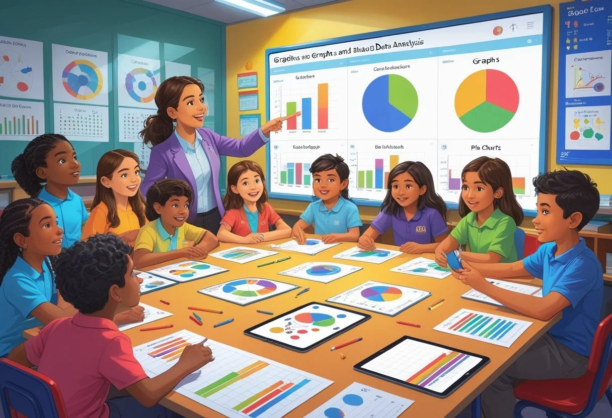
Teaching graphs and data analysis becomes more effective when students see their use in real-world problems. Applying these skills in different subjects shows how data helps explain scientific findings and social patterns.
Integrating Data Analysis into Science Lessons
Science classes offer natural chances to apply data analysis. Students can collect data from experiments, like measuring plant growth, and create graphs. These graphs help them spot trends and draw conclusions based on real evidence.
Teachers can ask students to use bar graphs, line graphs, or scatter plots to visualize results. Students learn to interpret data points and understand relationships, such as cause and effect in experiments.
This hands-on work strengthens students’ ability to analyze statistics and improves their critical thinking. It also shows them how graphing is essential to making scientific ideas clear and convincing.
Using Math in Social Studies and Daily Life
Math skills like graphing and data analysis fit well into social studies lessons. Students can study population growth, compare wealth across countries, or track historical events using charts and percentages.
They might calculate the percentage of a continent’s population relative to its wealth and display it in pie charts. This helps them understand economic disparities and patterns in human geography.
In everyday life, students use these skills to make sense of information, like reading sports statistics or analyzing weather data. Learning how to graph data clearly helps prepare students for better decision-making in daily situations.
Utilizing Technology to Teach Data Skills
Technology provides tools that help students learn graphing and data analysis clearly and actively. These tools enable easy creation of graphs and encourage students to explore data through engaging, hands-on experiences.
Digital Tools for Creating Graphs
Digital graphing tools allow students to make charts and graphs quickly and accurately. Programs like Google Sheets, Microsoft Excel, and online platforms such as Desmos let students input data, choose graph types, and customize visuals.
These tools offer features like automatic scaling, color options, and data labels. This helps students focus on understanding the data instead of struggling with manual graphing.
Teachers can also use software to display interactive graphs on smartboards, helping students see real-time changes when data is modified. This process strengthens skills in interpreting and creating graphs.
Interactive Platforms for Student Engagement
Interactive platforms provide activities that make learning about graphs more hands-on. Websites like Kahoot!, Quizizz, and Nearpod feature quizzes and challenges related to data interpretation and graphing.
These platforms often include collaborative projects where students analyze real-world data together. This promotes teamwork and critical thinking.
By involving students in digital exercises and competitions, teachers increase motivation. Students learn data literacy skills while staying engaged with fun, interactive lessons.
Frequently Asked Questions
Teaching graphing and data analysis involves using hands-on activities, games, clear explanations, and technology. Assessments and storytelling also help students understand how to read and create different types of graphs.
What are some engaging activities for teaching graph interpretation to students?
Using real-world data like favorite colors, sports, or snack choices makes graphing relatable. Sorting objects by size or color and then creating bar or picture graphs helps develop observation skills.
Students can collect data themselves and build graphs from that, turning abstract numbers into something concrete and fun.
How can games improve students' understanding of data analysis?
Games introduce friendly competition and motivate students to think critically. They can involve matching graphs to data sets or creating graphs to solve puzzles.
Games also encourage practice without pressure, making students more willing to try and learn from mistakes.
What are effective methods to teach the differences between various types of graphs?
Show examples of bar graphs, pie charts, and line plots side by side. Explain what type of data each graph represents best.
Hands-on activities where students create different graphs from the same data help them see how the presentation changes the story.
How can technology be incorporated to make learning about graphs more interactive?
Using apps or software lets students build and adjust graphs quickly. Interactive tools also allow for experimenting with different data sets and graph types.
Videos and online quizzes provide instant feedback, which keeps students engaged and supports self-paced learning.
What role does storytelling play in helping students grasp the concept of graph data analysis?
Storytelling connects numbers to real events or characters. When data is part of a story, students are more likely to remember and understand it.
It also helps them see why data matters, not just how to make charts, by linking graphs to real-life decisions or problems.
What are the best practices for assessing students' skills in graphing and data interpretation?
Use a mix of practical tasks like creating graphs and answering questions about data. Include both individual and group work to check understanding.
Regular short quizzes and project presentations can track progress and highlight areas needing more focus.