
Teaching Graphs and Data Analysis the Fun Way: Effective Strategies for Engaging Students
Teaching graphs and data analysis doesn't have to be dry or complicated. When students create and work with their own data, they stay interested and start to see how math helps explain the world around them. Making data collection and graphing hands-on and relatable is key to keeping students engaged and helping them understand important concepts.
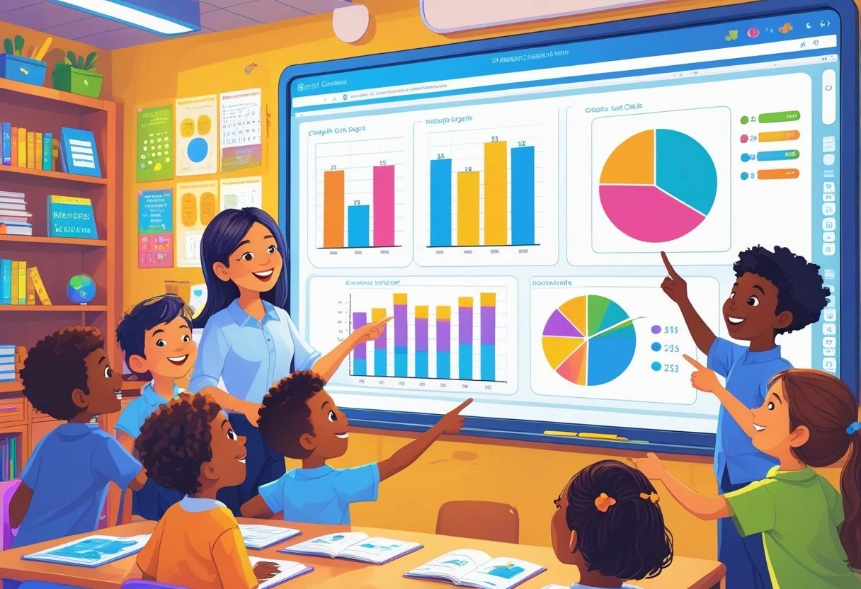
Simple activities like using tally marks, sorting objects, or playing data games can help even young learners grasp the basics. Introducing different types of graphs step by step allows students to gain confidence as they analyze and interpret information. This approach makes learning both fun and meaningful.
By combining clear instruction with interactive experiences, teachers can build strong skills in data interpretation. These methods also support learning across other subjects by encouraging critical thinking and problem solving.
Key Takeaways
Hands-on activities help students stay engaged with data and graphs.
Step-by-step exposure to different graph types builds understanding.
Interactive lessons strengthen critical thinking and cross-subject skills.
Making Graphs and Data Analysis Exciting for Students
Engaging students with graphing activities and data analysis can increase their interest and improve learning outcomes. Using hands-on approaches and connecting lessons to real-world topics helps students see the value of these skills.
Why Fun Approaches Enhance Learning
Fun activities motivate students to participate actively in graphing tasks. Games, interactive challenges, and group work make data analysis less intimidating and more enjoyable.
Students who enjoy the process are more likely to ask questions and think critically about graphs. This engagement helps them understand how to collect data, choose the right graph type, and interpret results correctly.
Adding competition or rewards can boost focus. For example, quiz games that cover bar graphs or line plots work well to review key concepts. These methods build confidence and support deeper learning.
Incorporating Real-Life Contexts
Linking graphing to real-life data makes lessons meaningful. Students can study topics like animal habitats, weather patterns, or sports statistics to create graphs based on real information.
Integrating subjects like science or social studies allows students to practice data analysis while exploring relevant content. For example, graphing an animal’s diet or mapping population data connects math skills to other areas.
Using familiar topics also helps students understand why analyzing data matters. It encourages them to interpret graphs in everyday situations, strengthening their ability to explain trends and draw conclusions.
Foundations of Collecting and Organizing Data
Collecting and organizing data are key skills for working with information. Data must be gathered carefully and then arranged so it is easy to understand and use. Doing this well helps students create clear graphs and find useful patterns.
Engaging Students in Data Collection
To get students interested in data collection, activities should be active and relatable. Students can create surveys by brainstorming questions about topics they care about, such as favorite foods or hobbies. This makes the process meaningful and encourages participation.
Using hands-on tasks like measuring classroom objects or recording daily weather allows students to collect real data. It is important they learn how to gather information accurately. Teachers can guide them in recording their results with tally marks or checklists.
Encouraging teamwork during data collection helps students share ideas and verify accuracy. This step builds a strong foundation for later sorting and graphing.
Effective Methods to Organize Data
Once data is collected, organizing it into clear groups is essential. Students should sort data into two or three categories to make it manageable. Common tools include tally charts, T-charts, and simple tables.
Sorting helps students see relationships and prepares data for graphing. For example, a tally chart can show how many students like different fruits. Tables allow them to arrange numbers or words in neat rows and columns.
Organizing data to scale is also important. It means keeping equal spacing between values so graphs are accurate and easy to read. Teaching these methods early builds skills for more complex analysis later.
Exploring Types of Graphs for the Classroom
Graphs help students organize and understand data clearly. Using the right type of graph makes comparing numbers easier and shows patterns quickly. Two common types useful in classrooms are bar graphs and picture graphs, which are simple to read and create with real data.
Understanding Bar Graphs and Their Uses
Bar graphs use bars to show data amounts. Each bar represents a category, and its height or length shows the value for that category. They are perfect for comparing different groups or tracking changes over time.
Teachers can have students collect data, like how many books each class reads, and then make a bar graph. This activity helps students practice counting and comparing.
Bar graphs work well for displaying clear differences in data. They can be vertical or horizontal. Labels on bars and axes are important for understanding what the graph shows.
Visualizing with Picture Graphs and Pictographs
Picture graphs use images or symbols to represent data amounts. Each symbol stands for a set number of items, making it easy for young students to grasp the information visually.
Pictographs are a common type of picture graph where repeated icons represent data points. For example, a smiling face may represent 5 students who like a certain story.
These graphs help students connect data with real objects, making math more enjoyable. They also encourage counting and grouping skills.
Both picture graphs and pictographs work best with small sets of data that students can relate to, such as favorite snacks or classroom pets.
Hands-On Graphing Activities
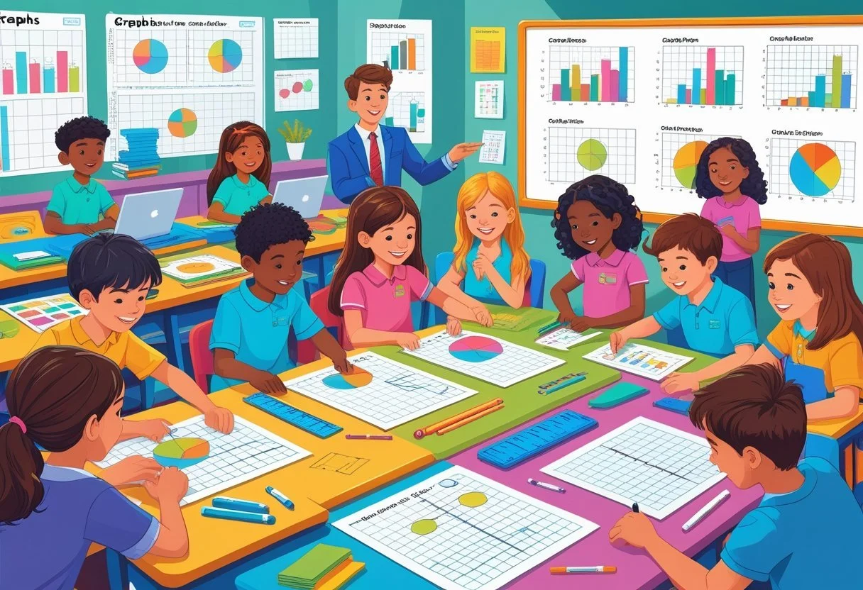
Hands-on activities help students understand graphing by actively working with data. They learn to create and interpret bar graphs and picture graphs through teamwork and using tools. These methods make abstract concepts easier to grasp.
Interactive Group Projects
Group projects encourage students to collect and organize real data together. They might survey classmates on favorite fruits or sports and record the responses.
Students then use this data to build bar graphs or picture graphs on chart paper or whiteboards. Working in teams promotes discussion about how to display information clearly.
This method allows students to practice reading and making graphs with data they gathered. It also builds skills in sharing ideas and making decisions about how to show numbers visually.
Graphing with Manipulatives
Manipulatives like blocks, tally marks, or counters offer a tactile way to learn graphing. For example, students can count colored blocks to fill in squares on a bar graph.
They also use picture cutouts to create picture graphs that represent quantities. This hands-on approach helps students see how individual items add up to totals.
Using physical items keeps students engaged and helps them link numbers to visual shapes. It simplifies understanding bar graphs and picture graphs by breaking graphs into manageable pieces.
Analyzing and Interpreting Graph Data
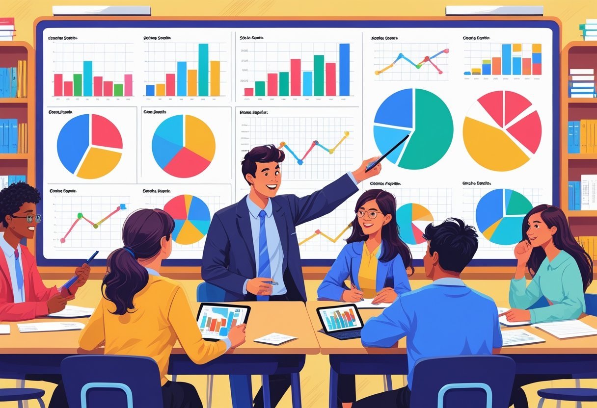
Students need to learn how to make sense of the information shown in graphs. This involves carefully looking at data points, spotting trends, and using what they find to answer questions clearly and accurately.
Building Analytical Thinking
Developing analytical thinking means teaching students to look beyond just the numbers in a graph. They must learn to compare data, recognize patterns, and identify any unusual points that might affect the overall picture.
One useful way is to have students organize data in tables before graphing. This helps them see exact values and makes the graph more meaningful. It also supports understanding the connection between raw data and its visual display.
Encouraging students to ask questions like “What does this trend mean?” or “Why are some values higher or lower?” strengthens their ability to interpret graphs. Analytical thinking grows when students explain their reasoning based on data, not guesswork.
Using Graphs to Answer Questions
Graphs are tools for answering specific questions using data. Students should practice reading graphs carefully to find exact values or changes over time.
They also learn to choose graph types that best fit the data, such as line graphs for trends or bar graphs for comparing categories. Knowing this helps them organize data in the most helpful way.
Using graphs, students can make predictions or conclusions supported by data. Teaching them to cite specific parts of a graph as evidence improves their data analysis skills.
Steps for this include:
Reading labels and scales carefully
Noting peaks, dips, or steady trends
Linking graph features to real-world meanings
This clear approach prepares students for tasks in science, math, and everyday life.
Delving into Line Graphs, Line Plots, and Pie Charts
These types of graphs help reveal different aspects of data. Line graphs show trends over time, line plots display frequency of data points, and pie charts highlight parts of a whole. Understanding how and when to use each makes teaching data easier and clearer.
When to Use Line Graphs
Line graphs are best for showing how data changes over time. They use points connected by lines to reveal trends, such as rising or falling values.
Teachers often introduce line graphs when students study weather patterns, sales, or growth. It helps students spot increases, decreases, or steady periods in data sets.
Line graphs work well with continuous data, meaning data that changes smoothly. These graphs make it easier to compare different groups across the same time period. Learning how to read line graphs builds skills in interpreting changes.
Exploring Line Plots in the Curriculum
Line plots are simple graphs that mark each data point along a number line. They show frequency — how many times each value appears.
Students often use line plots to track small amounts of data, like test scores or the number of pets in a class. This hands-on activity makes it easy to spot clusters or gaps in data.
Line plots help students understand data distribution. They are useful in early lessons because they require little preparation and clearly connect numbers to their frequency.
Making Data Visual with Pie Charts
Pie charts, or pie graphs, divide a circle into slices that represent parts of a whole. Each slice’s size matches its share of the total data.
These charts work best when showing percentages or proportions, like favorite ice cream flavors in a class or the division of expenses.
Pie charts teach students how to present categorical data visually. Using pie charts helps combine art and math, making lessons more engaging. They are especially useful for quick comparisons between categories.
Creative Strategies to Reinforce Graphing Concepts
Effective graphing lessons mix practice with engaging methods to help students better understand data collection and interpretation. Using varied activities and tools encourages students to stay interested while deepening their skills.
Review Activities to Solidify Learning
Review exercises help students practice reading, creating, and interpreting different types of graphs. For example, teachers can use real data sets like class surveys or weather reports for students to build bar graphs or pie charts. This makes data collection meaningful and concrete.
Another approach is to use interactive notebooks. Students can record their findings and sketch graphs by hand. These notebooks serve as both practice and a reference for graphing concepts. Question prompts, such as “What does this graph tell us?”, reinforce analytical thinking.
Simple worksheets with mixed graph types—bar, line, picture graphs—can test students’ ability to switch between different formats. Repetition with variety helps avoid boredom and promotes deeper understanding.
Games and Technology Integration
Games make graphing more engaging by turning data analysis into a challenge or competition. Board games or card games using real-time data collection keep students active and focused. Some games ask students to collect data points to complete a graph before others.
Technology tools, like interactive graphing apps and online simulations, allow instant feedback. Students can experiment with changing data and immediately see how graphs adjust. This visual interaction supports quick learning of key concepts.
Digital quizzes or games often include step-by-step data collection, guiding students through gathering information and graph creation. Combining play and technology keeps lessons dynamic and relevant to today’s students.
Extending Data Analysis Across Subjects
Graphing and data analysis skills can be very useful in many different subjects. Students can learn to use these skills to better understand information, solve problems, and explain ideas clearly.
Applying Graph Skills Beyond Math
Graphing is not only for math classes. Students use data analysis when they track personal habits, such as budgeting or fitness. For example, creating bar graphs or pie charts to show income and expenses helps build practical money skills.
Teachers can encourage students to analyze survey results or project data. This supports critical thinking, as students must choose the right graph type and explain what the data shows.
Using graphs in activities like games or worksheets also builds confidence with numbers. These tasks teach students how to organize data and spot trends, which are key parts of data analysis.
Connecting Graphing to Science and Literacy
In science, graphing is essential for understanding experiments. Students record measurements and display results with line graphs or histograms. This helps them compare changes and draw conclusions.
Teachers can make lessons more interesting by linking data to real-world topics. For example, analyzing weather data or plant growth combines science practice with graphing skills.
Literacy skills benefit when students interpret or write about graphs. Reading and explaining data supports comprehension. Writing captions or reports based on graphs helps students communicate clearly.
By connecting graphing to science and literacy, students see how data analysis supports many areas of learning.
Frequently Asked Questions
Teaching graphing and data analysis can be made engaging by using hands-on activities, real-life examples, and simple data tasks. These methods encourage students to collect, organize, and interpret data independently.
What are engaging activities to introduce graphing to middle school students?
Students can create graphs using data they collect from surveys, experiments, or classroom observations. Activities like a trashket-ball challenge or graphing student preferences help make the process interactive.
Using task cards with different graph types and questions can guide students to practice making bar graphs and line plots. Games that review data analysis also keep students interested.
How can high school students learn about graphing through interactive activities?
High school students benefit from exploring graphs tied to real-world data, such as sports statistics or weather trends. Creating their own data sets and interpreting various graph types deepens understanding.
Simulation tools and digital graphing apps allow students to manipulate data and see changes instantly. Analysis projects help them uncover patterns and insights from complex data.
What are effective ways to teach data collection to students?
Starting with simple data collection tasks like counting class items or voting on favorite snacks works well. Students can learn to organize data using charts or tally sheets before graphing.
Encouraging students to ask questions they want to answer with data motivates careful collection. Group activities improve cooperation and make data gathering fun.
Which activities can make teaching data analysis enjoyable for elementary students?
Elementary students engage with graphing by using colorful objects like blocks or stickers to create bar graphs. Sorting and grouping activities prepare them to analyze simple data sets.
Games designed as review sessions give students practice reading and interpreting graphs. Using stories or scenarios that relate to their interests increases motivation.
How can data analysis be incorporated into kindergarten lesson plans?
Kindergarten lessons can include sorting objects by color or size and then graphing the results with pictures. Simple questions about "which category has more" help build early analytical skills.
Hands-on activities that include moving objects to graphs and talking about the data keep young students involved. Using anchor charts visually supports their learning.
Where can I find first-grade graphing worksheets that are fun and educational?
Many websites offer free downloadable worksheets that include simple graphs and data sorting activities. Teachers also share resources with easy-to-understand instructions and colorful visuals.
Resources often contain a mix of task cards, quizzes, and practice sheets to maintain student interest. Look for materials designed for first graders that focus on bar graphs and picture graphs.